Monday, 13 May 2013

Monday, 29 April 2013
Titles/ Adverts
Titles/Adverts/Sponsers
Again From my audience feedback i realised my titles were very poor, i then went onto to improve them adding more professional fonts and adding extras at the begining and end of my video. I added a William Hill advert at the end to show that the documentary is sponsered by William Hill and also added the begining of a Channel 4's programme.
Voice over improvment
Voice over improvment
From my audience feedback, i found that a lot of the comments were critical of my orginal voice over that it does not fit to the pictures shown on the screen and the female voice did not fit to my audience, so i decided to make some improvments and change my audience and content within the documentary.
Audience- mixed audience, from families to couples to attract them to come to the races and learn the facts about Beverley racecourse and flat racing itself but mainly what a day at the races consists of.
For my voice over to fit my audience i decided to go from a female voice to a male voice as i wanted to portray a professional feel to it, as it is a prodominantly male industry.
I cut out the facts about betting in my voice over and mainly focused on what a day at the races involves and what Beverley racecourse itself has to offer, looking at why the races is so popular.
Thursday, 20 December 2012
Monday, 17 December 2012
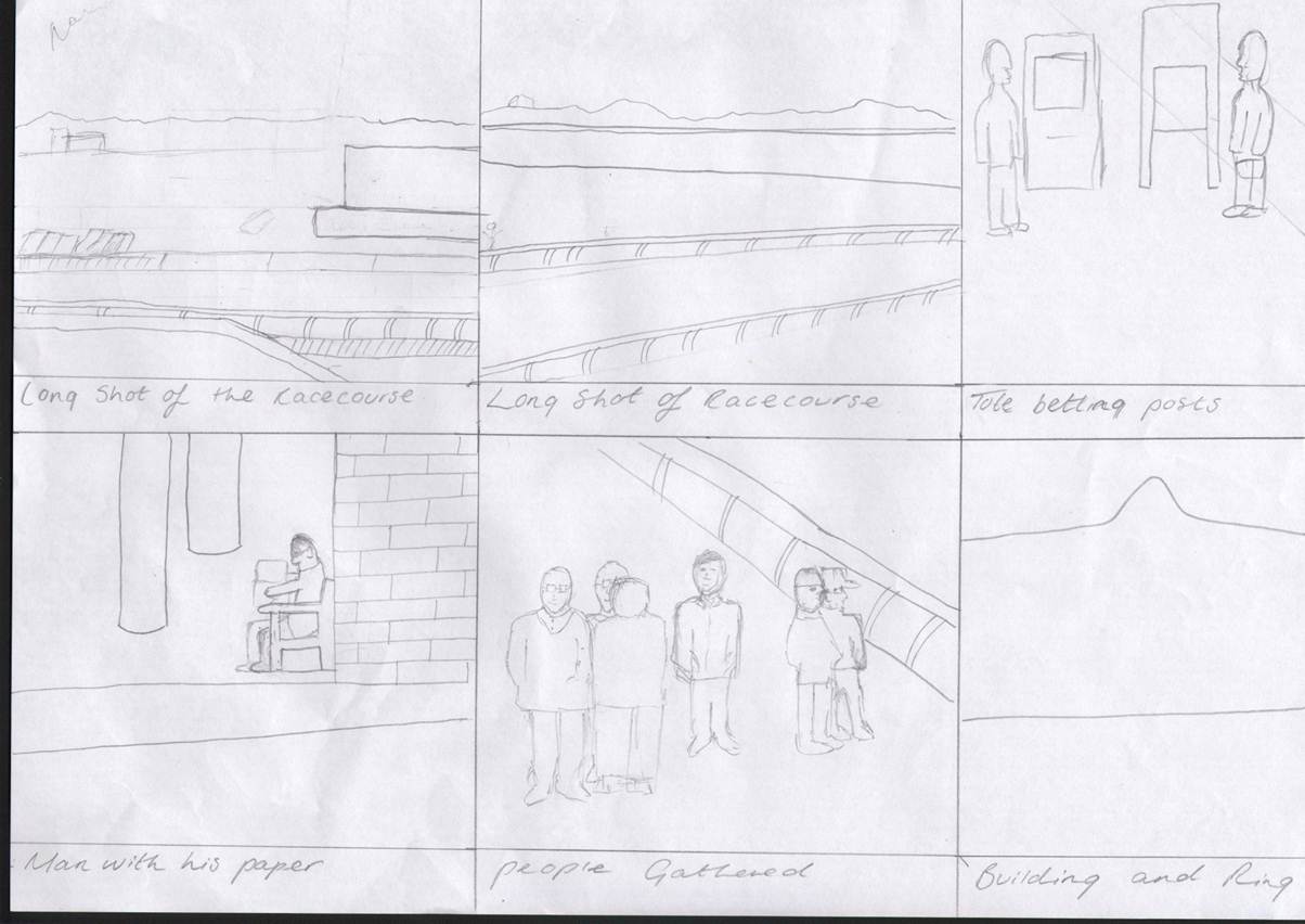
Storyboard
Here is my finished storyboard which i followed when filming as i had an ideas of what shots i needed...




Wednesday, 12 December 2012
Monday, 10 December 2012
Evaluation Scripts
Evaluation Scripts
The first one i am going to talk to the camera... The second one is going to be a podcast, The third one will be an interview and the last one will be someone following me with a camera showing you the technqiues...

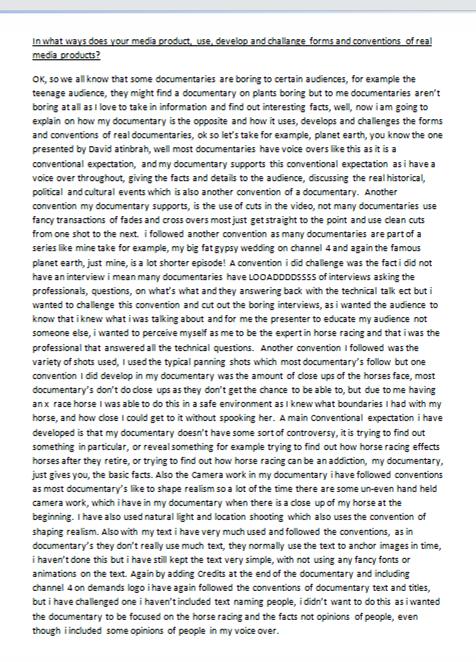


Here is my Evaluation Scripts i went by when filming my evaluation...
Thursday, 6 December 2012
Voice over Script
Voice over Script


I got my friend Caitlin to record the voiceover for me because she had a much clearer voice and was a lot more fluent.

Thursday, 22 November 2012
Radio Times
Then I went onto look at a magazine which would most likeley feature my double page spread, The radio times, Here is a another double page spread in the radio times on a documentary called Frozen Planet.


We can clearly see it is an eye catching double page spread with a very large picture of ice, a polar bear and a camera crew spread over the two pages, The article is titled ‘Lure of the pie’ a catchy slogan explaining how they got so close to the polar bears ‘Lurring’ the polar bears in for ‘Pie’ , above the slogan is a caption ‘ the bigger picture’ in red resembling the big picture over the two pages but also saying that this documentary shows you it up close. The text starts with the title of the documentary and when it is been shown BBC 1 at 9.00pm, The two columns are explaining what the documentary is about giving quotes from the frozem planet team and explaining what they did in the artic to get up close and personal with the polar bears and what really happened behind the scenes giving real stories to the readers as that is what they want to hear the 'action' and the funny stories. In the right hand corner of they put an image within an image putting it smaller in the right hand corner as it is not as important as the larger image that cover the two pages, with the image ontop of the image it comes with a caption don’t feed the bears, catchy and fun for the audience to read bringing humour to the page. On the right hand page on the right hand side is a column, a column advertiseing what other programmes are on bbc and what is most talked about, I could use this is my double page spread to advertise other tv programmes on channel 4.
Double Page spread 'Empire'
Awkward Sex and the City 'Empire'

Here I looked at Another double page spread has the same layout as taken in ways, with an interesting colour scheme of orange black and white, the use of arrows to break up the page, and one big picture, But they have used the right hand page to advertise other programmes at the right hand side of the page in a column which also breaks up the page.
Taken 2 Double page Spread
Taken 2 Double page spread
I then went onto look at some examples of double page spreads looking at the layout of them what they consist of and seeing what I liked best about each double page spread. Here I have looked at a double page spread on Taken 2.


This was taken from the Magazine 'Empire' I can instantly see that the page is well layed out looking simple and sophisticated with three columns of text, one large picture of liam neason who is a well known actor in the middle of the page to catch the readers eye as liam neason is famous for taken 1. The double page spread uses blue arrows to break up the page making it more attractive to the eye. Another reason why the double page spread is neat and clear is because is uses a colour scheme of black white and blue making it looks classy and not muddled up. As all articles do it has a big bold title at the left hand side of the double spread making it noticable and simple of what the article is about. At the start of the double page spread it starts off with some key facts of when the film was released, the cast, the director and plot making it simple for people to read, also widening its audience as even if someone hasn’t watched the film they can still read the double page spread and understand it. Other key facts are at the right hand side of the page to the left of the picture with a title of ‘Look closer’ giving key backstage facts.
Sky Sports Newspaper Advertisment
Sky Sports Newspaper Advertisment
Because i want to make another Newspaper advertisment i decided to do some research into other newspaper advertisments other than Channel 4's here is an example of another newspaper advertisement for sky sports advertiseing the rider cup.

It has a big bold statement picture as the background with the sky sports logo at the bottom right hand side of the page making it noticeable to the reader and as they say to make it pop out of the page, At the left hand side of the page is a faded blue banner down the side this is to make the text that is ontop of the banner stand out and also make it readable. At the top of the banner is a big bold slogan in capitals saying ‘its golf but not as you know it’ intruiging the audience and drawing them in making them watch to watch it. Underneath the big bold slogan is the Ryder cup logo so readers instantly know what it is advertising underneath the logo is information of when it is going to be viewing in smaller text Then again underneath that is some more text to tempt the reader into watching the golf making them believe that it will be ‘dramatic’. Underneath this is the Sky 3D logo, advertiseing sky 3d catching the viewers eye and also in text above the logo text which points out that it is ‘exclusivley live in 3D’ using the word exclusivley to make the viewer more tempted to watch the golf. At the bottom of the banner is some more text advertiseing sky itself, also getting the chance to tempt existing sky viewers into upgrading and purchasing sky sports to watch the Ryder cup as not all sky customers have sky sports in the package deal.
I believe this newspaper has too much text as I want my newspaper advertisement to be quick to read and eye catching but I do like the idea of the banner down the side of the page making the text stand out and not blend into the picture in the background.
My Channel 4 Advertisments
My Channel 4 Advertisments
Looking at all the channel 4 advertisements most of them have a simular layout with the contrasting colours with the big bold channel 4 logo and the font of the texts and also how the pictures are related to the programme overall and how it is kept very simple. Because I can see my documentary been on channel 4 I decided to base my advertisement around the channel 4 layout, picking out key features of the advertisements and putting it into mine but changing things around.
Here are my drafts formy newspaper advertisement…


As you can see my newspaper advertisements are very plain compared to other newspaper advertisements that are non Channel 4 many have faceboook links, hashtags for twitter, scan barcodes, websites ect, but because my documentary would shown on channel 4 I decided to stick with the channel 4 theme keeping it simple and not inclusing any facebook logos, hashtags ect
But I also wanted to look at other newspaper advertisments other than channel 4’s and make another newspaper advertisement for another programme to show what my newspaper advertisement would be like if It wasn’t showed on channel 4, including the facebook links, hashtags, barcodes ect
Channel 4 Advertisment: Non-Sense
Channel 4 Non-Sense
I then decided to look at another newspaper advertisement for channel 4 called Non-sense a programme about sight.

Looking at the advertisement you can see straight away it is about sight showing a clear simple picture again of a woman looking straight at the camera but with her eyes blurred clearly representing she is blind, keeping it simple and eye catching and easy to understand. The channel 4 logo again is in the middle of page in contrasting colours making it stand out to the audience again to show it is on channel 4. A difference is that this time it is not a big title at the top of the page it is a catchy slogan which is a rhetorical question 'What are you looking at?' Representing that the blind are always been stared at but they also cant see what people are looking at making the audience more interested in the programme as they want to find out what it is all about. Again at the bottom of the page is the general information about the show making it clear when the programme is, again this has a bold background and contrasting text to the background to make it stand out which most of channel 4 advertisements have.
Channel 4 Newspaper Advertisments
Channel 4 Newspaper advertisments
Now for creating my own newspaper advertisement I am going to look at some existing ones and see what qualities they have..
Here is a channel 4 newspaper advertisment for high on blow, about a man who follows storms..

Here they have used a Bold heading, they have made it bold by using black over white using contrasting colours to make it stand out also made the font bigger than the rest of the texts to show clearly that it is the name of the programme ‘High on blow’, they have titled it like this to suggest that the man is getting ‘High’ off the storms as ‘blow’ is another word for ‘cannabis and cocaine’ but here ‘blow’ is used to represent the storms. They have also put the logo of channel 4 in the middle of the page to catch the readers eye and to show clearly that this programme is shown on channel 4 again they have used contrasting colours by putting the white 4 logo over a dark background. In the right hand corner of the page they have put in small the logo of Volkswagen who sponsor this documentary. They have then put the slogan of the show ‘A very british storm junkie’ again suggesting that the man is addicted to the storms they do this by using the word ‘junkie’ which is associated with people who are ‘addicts’.Underneath the slogan is when it is giving the information to the audience, again using contrasting bold colours to make it stand out against the rest of the advertisement. For the picture They have used a simple clear picture for the background of the advertisement keeping it clear and eye catching but also explaining the show itself.
Subscribe to:
Posts (Atom)